

UniWatch Reviews the Marlins' New Duds
Tuesday, March 27, 2012
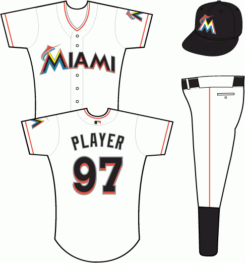
The Marlins -- now the Miami Marlins -- have gotten a complete overhaul. Public opinion seems to be mostly along the lines of "Those sure look silly," but here's a little secret: Uni Watch thinks they look pretty good, especially the home whites. Sure, they used too many colors, but Miami is a colorful town, so why not? And did anyone -- seriously, anyone -- really love the old design? Yes, there are a few problems, mainly involving the ginormous cap logo and the absolutely brutal uni numbers, but I bet those get tweaked in a year or two. When you look at the whole package, the feeling here is that it's not so bad.We're guessing you might not agree with Paul Lukas' assessment of the old uniforms (since so many people are apparently in love with teal), but we were never truly wed to them either.
Image via SportsLogos.net


0 comments:
Post a Comment