

Miami Marlins: Part Deux
Tuesday, September 20, 2011
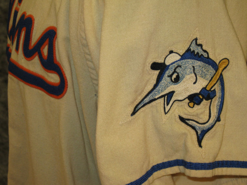 |
| Whatever the new uniforms look like, we'd love to see this old Miami Marlins sleeve patch included somehow. |
Rainbow Colored

Spare me the "Miami is a city of many vibrant colors. . . blah blah blah." If the team is trying to be progressive and use three, perhaps even more, colors, it will most likely fail and cause an uproar. Fans want their team to have an identity. That means one, maybe two colors that people recognize as the team identity.
Orange-centric
Another concept making the rounds is that the new set is very orange-heavy. It wouldn't be too surprising considering the amount of orange that's been introduced in team marketing materials the last several years. Hell, go to the Marlins' official website right now and tell me the first color you notice.
Not too many teams have orange as a very prominent color. The detractors say we'll look too much like the Giants or the Orioles. I doubt they would opt for a traditional orange though. A softer tone (Creamsicle Bucs? Don't laugh) or a burnt orange look would be pretty unique in baseball.
Blue and Orange

Official Guess
Taking in all of the inside info and trusty anonymous comments on our blog, my official guess would be that new Miami Marlins colors/logos will consist of the following:
- A black base (hat color, trim etc.)
- Some kind of orange as the primary color
- Silver and some sort of blue (seat color) used as accents
- A logo that incorporates all of the above and the other colors in the stadium logo. We'll all hate it.


2 comments:
Why not a predominant yellow? Miami is Sunny and Bright. Also, only 3 teams really utilize yellow and all as an accent; Pirates, A's, and Brewers.
Yellow and Silver/White would be unique and not so garish and some of the other ideas tossed around.
It's a good idea. I think if it weren't for the recent Rays redesign, we would see a combo like that or a yellow-sky blue look.
Post a Comment