

Stay Calm, Everyone
Thursday, November 3, 2011
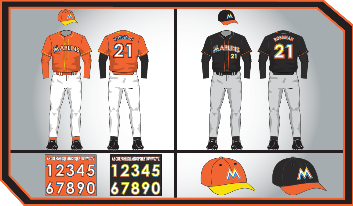
The Miami Marlins will unveil their new logo and uniform sets a week from tomorrow, but uniform watchers were subject to some subpar trolling from another Marlins blog today. James Etzbach of Marlin Maniac posted the uni sets below this morning (and there is no link to the source - Michael Jong hasn't been gone for a month and the standards have fallen). Ted did some digging and found the source, where the artist commented, "Here's my take on the new unis, stictly based on what we know for sure about them so far." Nice try, dude.
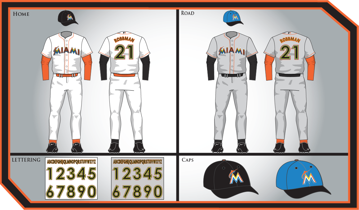 |
| Click to enlarge either image |
As Etzbach notes, placing "Miami" on the home jersey goes against normal protocol (typically place names go on the away jersey, while team names or logos are on the home jersey). Further, the teal cap makes little sense, since teal has been relegated to an accent color. (Sidebar: I still don't understand how there is a significant faction of Marlins fans that long for the original teal uniform set, but hate the leaked new cap logo. Both are ugly, and it's pretty clear they are letting misplaced nostalgia cloud their judgment...)
Regardless, I must say I like the white and grey sets (the black and orange alts are just kinda meh). Etzbach compares the set to something worn by a minor league club, but methinks the gentleman doth protest too much. Miami is a garish place, if our sports teams decide to reflect that garishness in their uniforms, that is just fine with me. Plus, there is something to be said for embracing the aesthetics of ugliness (both Ted and I listen to avant garde jazz, so you can probably guess where we stand on the issue of ugliness).
I will give the final word to Ted, since he put it best: "But fear not, the real unis should be equally or more appalling."


0 comments:
Post a Comment